That Moment Re-imagined
- Kayla Immel
- Jun 19, 2019
- 2 min read
This is a project and client that have been dear and near to me from day one.
Just out of Design School, hungry for work and wanting to prove to myself that I didn't just waste my time and money on a degree that would have no monetary success. I think at the time I was working two nanny jobs, a part time marketing position at a real estate office, and freelancing. I remember feeling like somewhat of a failure because here I was a year out of school, still not making that #bank every college grad falsely believes comes automatically with the diploma. Little did I know that at this same time, one of my friends was also hustling for that dream career. And then that text message came through. That little redeeming request for a full fledge #branding project.
(*Side note; Through the years, Franchot has been a huge source of support for my career and I couldn't write this post without saying 'Thank You'. You rock and your talent is vast!)
Anyhow...
That original website and logo weren't terrible. But man, in just 5 years technology and web design have come a LONG way!

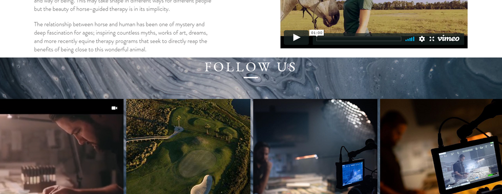
Needless to say, it was time to bring That Moment Productions up to the current moment of web design functionality. I rebuilt the website based on a site that owner, Franchot Barba, had sent to me. The site featured a clean, parallax layout, with an elegant sophistication. Being a #videographer, Franchot had plenty of stunning visuals to highlight, making my job easier. Along with the new website, I also took his original #logo and gave it a subtle update.

The thing about brands, websites, and businesses in general is that change is inevitable. If you aren't evolving, there's something missing and it's time to really look at what you're doing. I was taught that a website should be rebuilt every 4 years, but even that practice has gone out the window!
Working on this rebuild was a solid reminder to never stop learning, never stop striving to perfect your craft and talents, and never ever settle just because you're comfortable. The old website had some great features, like video content in the header of each page that coordinated with the page topic. But it lacked the stylistic connection to Franchot's body of work, the design was no longer relevant to the content that was being produced. There was also a lack of modern SEO practices implemented throughout the site, something that as a small, local business, you simply cannot afford to be missing out on.
The transformation process was a team effort that I shared with Franchot, relying on his preferences and eye for aesthetics. Once the site was ready to be launched, I walked him through the process of setting up his #Gmail for business account and how to edit his new site. Then end result is a modern, flat design that features parallax scrolling, a dark, sophisticated color palette, on-page SEO, an Instagram feed, and quick-touch links on mobile for easy calling, emailing and social media following.


If you've been contemplating the relevancy of your brand and/or website, it's time to update!


The Global Skills Meet serves as a meeting point for learners, educators, and professionals eager to expand their expertise. From hands-on sessions to thoughtful keynotes, each element is designed to enrich your skill journey. Participants are encouraged to exchange ideas and build meaningful connections. This event brings global perspectives to local challenges.